

Airolite
BRAND IDENTITY | UI/UX | MARKETING | SOCIAL | GUIDELINES
The interplay of aesthetics and structural purpose in Airolite's architectural products embraces Frank Lloyd Wright's ideology that "form and function are one." Designing for a broad audience of architects, engineers, and contractors required branding that worked just as hard as Airolite's products, both aesthetically and functionally.
Minimal design and inspirational imagery, tailored to an architect's aesthetics, elevates industry into art.
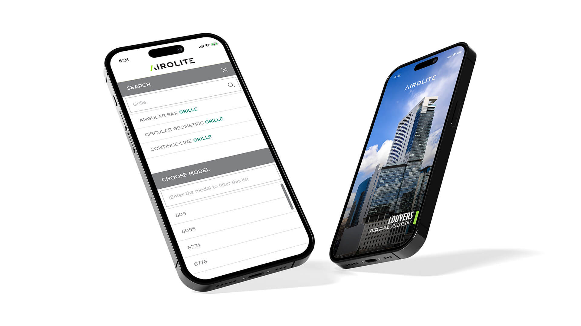
A clean and functional UI speaks the language of engineers and contractors, providing the information they need to specify Airolite products.
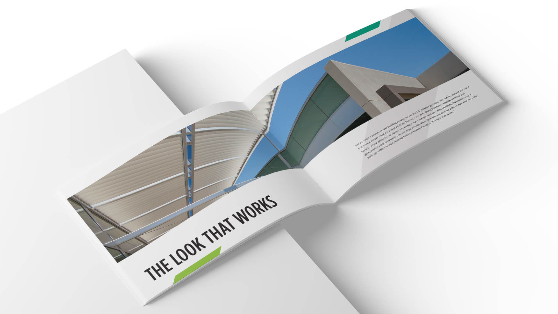
Inspired by the rhythm and repetition of architectural louvers, grilles, and sun controls, Airolite's brand refresh accentuates their product's form.
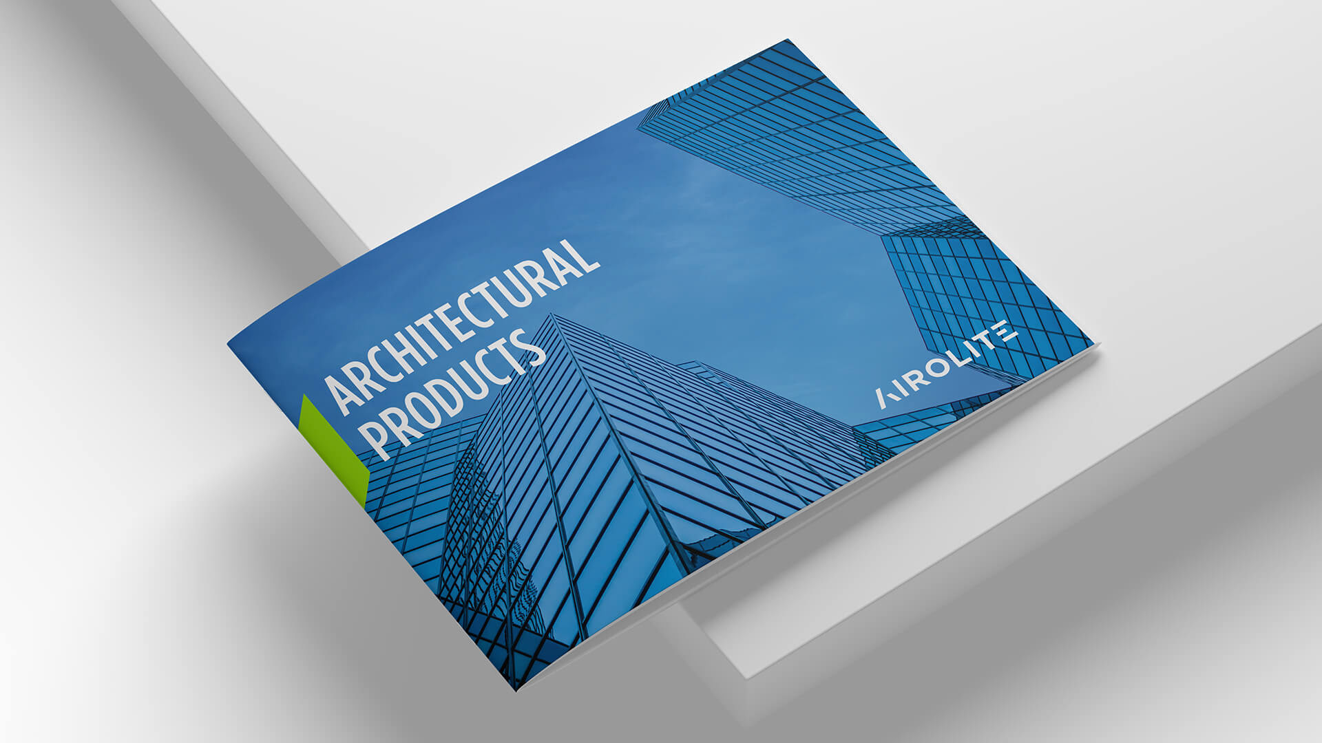
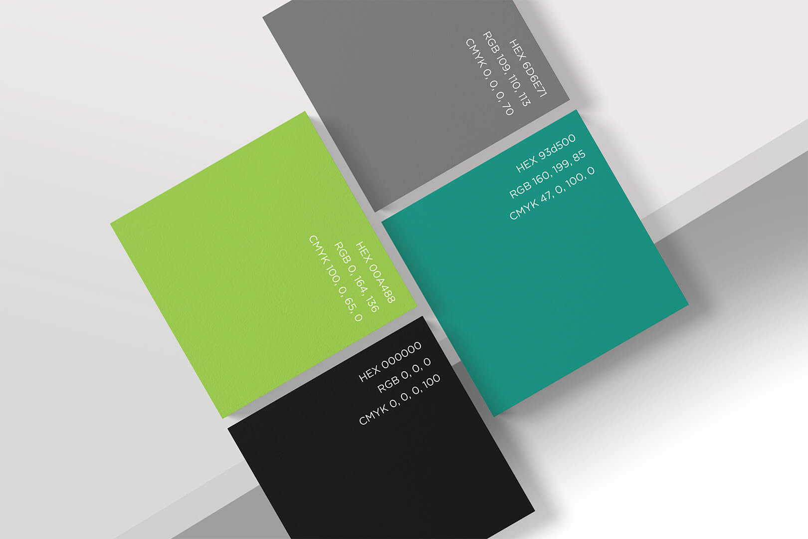
The sky itself adds a cameo appearance to the color palette, reflected in architectural glass, defining and connecting the spaces between structures.

Minimal design and inspirational imagery, tailored to an architect's aesthetics, elevates industry into art.
A clean and functional UI speaks the language of engineers and contractors, providing the information they need to specify Airolite products.
Role: Creative Direction, Design
Marketing: Anthony Jackson, Jamie Charneski
Photography: Dana Sohm, Peter Vance
Developer: Britt East
Copywriter: Jody McCormick