

Greenheck Group
BRAND IDENTITY | MARKETING | PRESENTATIONS | GUIDELINES
Uniting ten customer-facing brands under one corporate umbrella, Greenheck Group's new identity repositioned the company as a modern, innovative, global leader in the commercial HVAC industry and an employer of choice for new recruits.
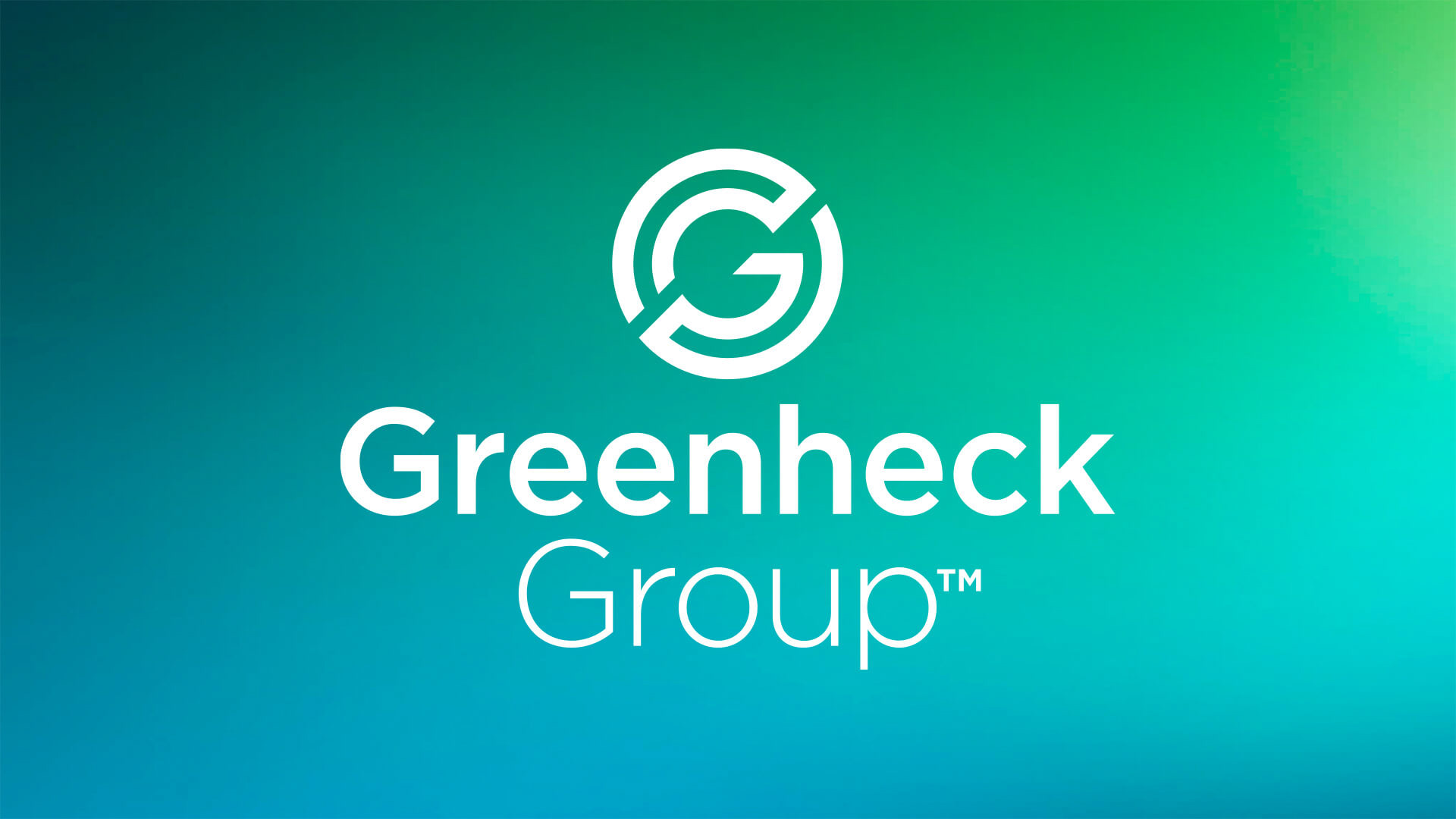
The "Pathways" brand mark expands outward from the core, tracing a path of forward momentum and opportunity, representing potential career growth and Greenheck Group's interconnected network of people and brands.

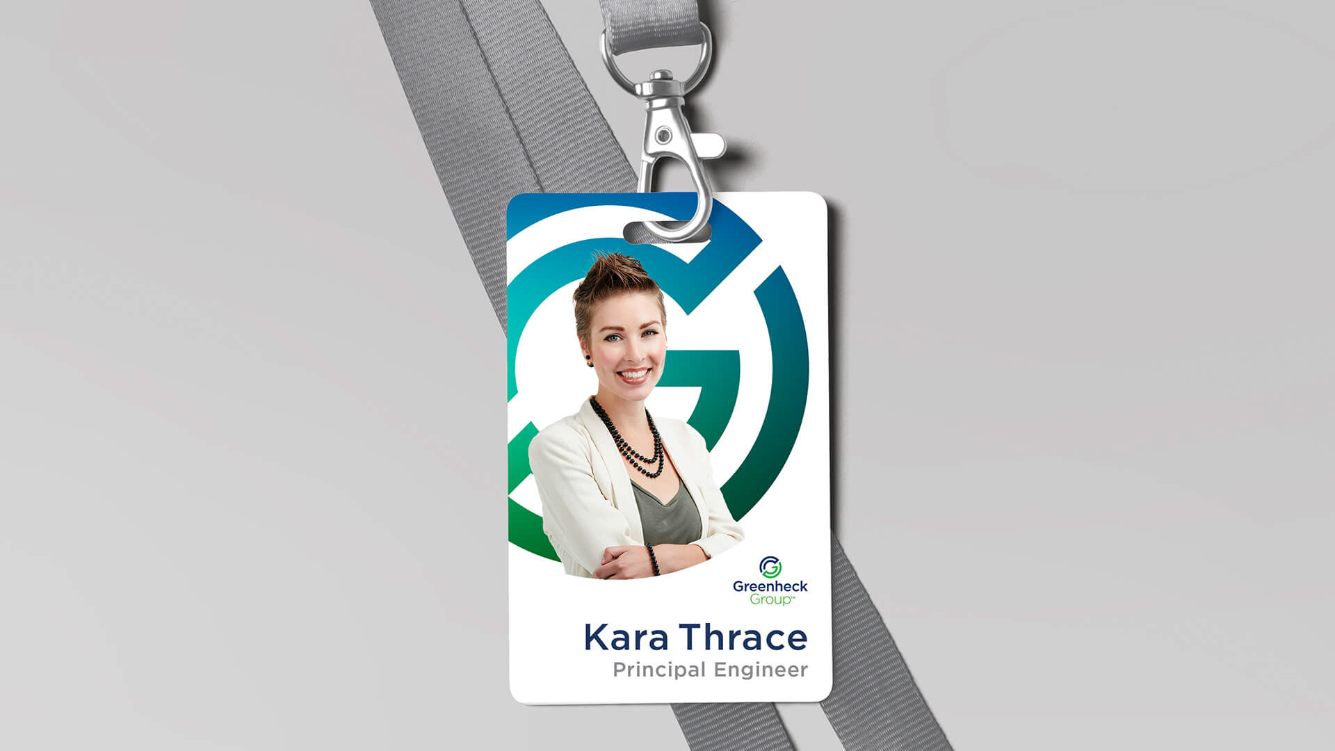
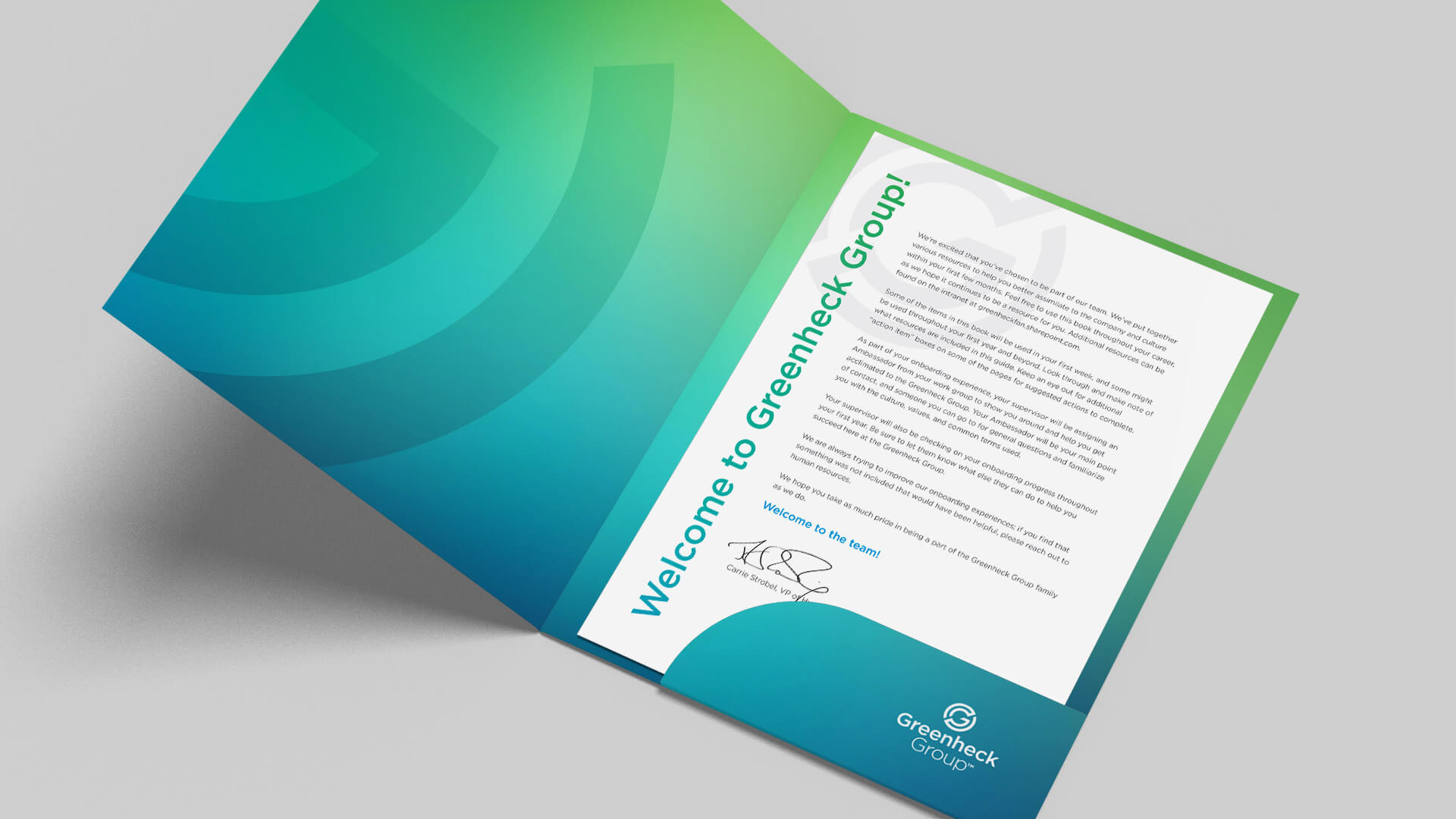
The design system's vibrant, inclusive color palette incorporates colors from each customer-facing brand into a spectrum, celebrating the individuality and diversity of the employees at the heart of the company.

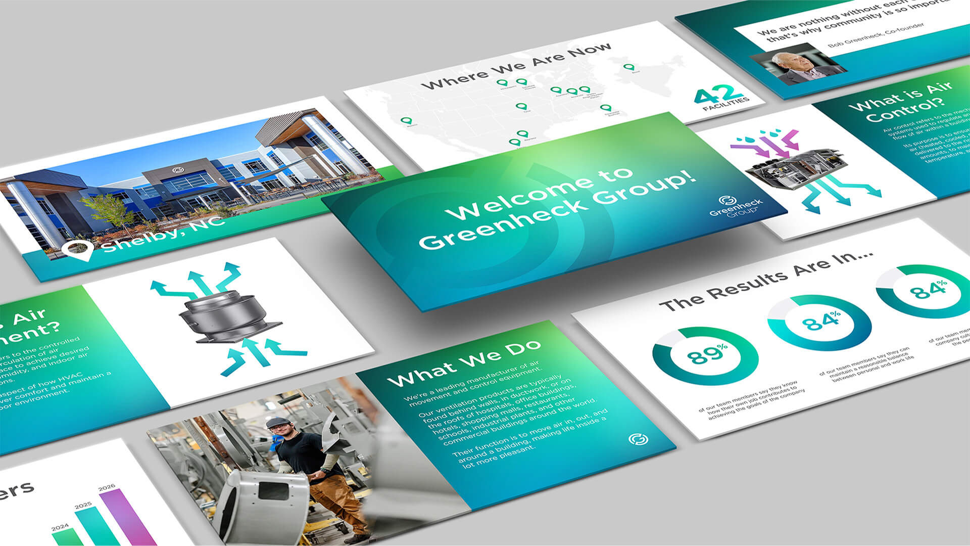
In application, vibrant graphics, authentic imagery, and firsthand testimonials resonated strongly with Gen Z graduates at recruiting events and digital campaigns. Since implementation, the design system contributed to an increase of roughly 1,500 new hires over a five-year period.
Current employees embraced the modernity of the new logo with pride, flooding internal social networks with positive comments.
One of the most versatile projects created for Greenheck Group, the fully functional, code-compliant model school is used to educate new recruits, provide engineers with continuous learning through an online interactive experience, and generate photorealistic assets for use in marketing.
Role: Creative Direction, Design
Marketing: Bryan LiBrandi, Erik Koenig, Heather Maves
Designers: Michaela Beck, Nathan Boehnen
3D: Alan Primm, Vantage Point Marketing
Architect: Hub + Weber
Mechanical Engineer: SHP Environments